The tipping screen that appears at the end of a delivery order is one of the most carefully engineered moments in the entire transaction. As someone who started paying attention to it after noticing I was tipping more than I intended to on orders I wasn’t particularly happy with, I learned how deliberate the design decisions actually are. Today I’ll share what’s going on and what it means for paying workers fairly.
Default Anchoring
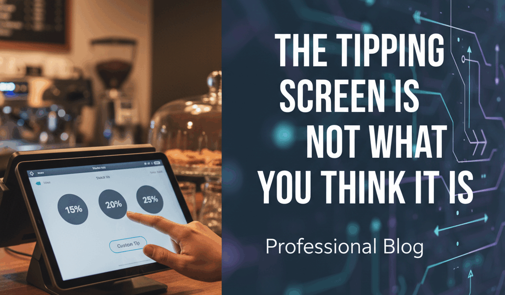
The most consequential design choice on a tipping screen is the default selection. When a delivery app pre-selects 18% rather than 15%, a significant percentage of customers will tip 18% without thinking about it — not because they decided 18% was right, but because the default is sticky and changing it requires an active decision. Apps have tested different defaults extensively, and the default percentage is a deliberate business decision, not a neutral presentation of options.
The same anchoring effect applies to the buttons offered. If the choices are 15%, 20%, 25%, and custom, the middle options look moderate and the custom option looks like the one you’d use only to tip less. If the choices are 20%, 25%, 30%, and custom, the same customer who would have chosen 15% now has to actively select custom and type a number below the lowest displayed option.
The Pre-Order vs. Post-Order Difference
Some delivery apps show the tip screen before the order is delivered. Others show it after. The timing is a significant variable in how much gets tipped. Pre-order tipping tends to produce higher average tips, partly because customers are optimistic about delivery quality before anything has gone wrong, and partly because the tip feels more like part of the payment decision than a retroactive evaluation.
Post-order tipping is more accurate — you know how the delivery actually went — but produces lower averages. Apps that moved to pre-order tipping almost universally saw their tip averages increase. That’s what makes the timing decision endearing to platform economists and significant for drivers, who have structured their income expectations around whatever timing the platform uses.
The 0% Friction Test
Some apps have tested how tip amounts change when they make the no-tip option more or less friction-laden. Requiring a customer to type “0” in a custom field produces fewer zero-tip outcomes than displaying a “No tip” button as an equal option alongside percentage choices. The friction-based approach is well-documented in behavioral economics and is applied deliberately in tip screen design. I’m apparently someone who didn’t notice this until I tried actively tipping zero on an order I was unhappy with and found the process surprisingly difficult.
What This Means for Workers
Delivery drivers depend on tips as a meaningful portion of their income. Understanding that tip screens are optimized to influence behavior doesn’t mean tips are optional or that the optimization is cynical — the platforms are genuinely trying to ensure workers are compensated adequately. Stopping for a sec — this is the key bit. — tipping on delivery orders based on distance and order complexity rather than the default percentage is a more direct way to pay workers appropriately for the actual work, rather than letting a pre-selected button make the decision for you.

Leave a Reply